Typesetting Is Why Some Books Are Easier to Read

I remember sitting in a windowless editorial office in 2004, staring at a manuscript that was, quite frankly, a masterpiece of prose, but an absolute nightmare to actually consume. The lines were so tight and the margins so narrow that my eyes were physically aching by page ten. It wasn’t the writing that failed; it was the layout. People love to obsess over word choice and plot twists, but they completely ignore how typesetting affects readability, treating it like a decorative afterthought rather than the structural foundation it actually is. If your reader is fighting the page just to finish a sentence, they aren’t thinking about your brilliant metaphors—they’re thinking about closing the book.
I’m not here to give you a lecture on the history of serif fonts or sell you on some expensive design software you don’t need. Instead, I’m going to show you the practical mechanics of a clean layout. We’ll talk about leading, kerning, and why your choice of white space is just as important as your choice of verbs. I’ll give you the honest truth about what makes a page breathe and what makes a reader quit, so you don’t waste your budget on a book that is visually exhausting.
Why Improper Line Spacing and Eye Strain Kill Sales

Let’s be blunt: if a reader’s eyes start dancing erratically across the page, they aren’t going to finish your chapter; they’re going to close the book. When you cram text together without considering line spacing and eye strain, you aren’t just being “efficient” with page counts—you are actively taxing the reader’s brain. Every time a reader loses their place because the lines are too tight, they experience a micro-moment of frustration. Do that fifty times in a single sitting, and you haven’t just lost their attention; you’ve lost the sale.
It’s a matter of physics and psychology. If you ignore fundamental typography principles for legibility, such as providing enough “breathing room” between lines, you increase the cognitive load required to process even simple sentences. A reader should be able to glide through your prose, not stumble through it like a trekker in a fog. If your layout forces them to work that hard just to decode the words, they will subconsciously associate your writing with exhaustion. And nobody ever paid twenty dollars to feel tired.
Typography Principles for Legibility What Professionals Actually Charge for
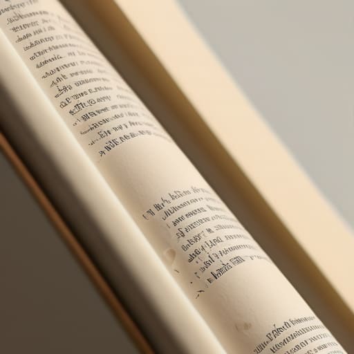
When you look at a quote for professional typesetting, you aren’t just paying for someone to click “center align” on your headers. You are paying for an expert to manage the invisible friction between the eye and the page. A significant portion of that fee goes toward mastering typography principles for legibility—specifically the technical nuances of font kerning and tracking. If the letters are too tight, they bleed together; if they are too loose, the reader’s eye skips across the line like a stone on water. Both scenarios break the reader’s immersion, and once a reader feels that friction, they rarely pick the book back up.
The rest of that invoice covers the structural math of the page. A professional knows how to balance white space and cognitive load, ensuring the page doesn’t feel like a wall of impenetrable text. They are calculating the optimal line length for reading so the eye doesn’t have to travel too far left-to-right, which prevents that exhausting “doubling back” effect. It is a technical discipline, not an aesthetic one, and it is exactly what separates a book that feels expensive from one that feels like a self-published afterthought.
Five Ways Your Layout is Quietly Driving Readers Away
- Stop treating margins like wasted real estate. If you squeeze your text too close to the edge of the page to save on paper costs, you’re creating a claustrophobic reading experience that makes people want to close the book. Give the words room to breathe; it’s the difference between a comfortable stroll and a crowded subway car.
- Watch your widows and orphans like a hawk. There is nothing more unprofessional than a single, lonely word sitting on its own line at the end of a paragraph, or a header stranded at the bottom of a page. It’s a technical error that signals to a reader—and a publisher—that the job was rushed and the quality is suspect.
- Don’t get precious about your “unique” font choices. I see too many debut authors picking decorative, swirling typefaces because they look “literary,” only to find that no one can actually parse the sentences. If the reader has to work to decode the letters, they aren’t engaging with your plot; they’re doing manual labor, and they won’t pay for it.
- Respect the hierarchy of your headings. A reader should be able to flip through your book and understand the structure just by glancing at the scale and weight of your titles. If your subheaders are the same size as your body text, you’ve destroyed the roadmap, and a lost reader is a lost sale.
- Mind the “river” effect in your justified text. When your software tries too hard to force text to hit both margins, it creates these awkward, white gaps running vertically through your paragraphs. It’s a visual distraction that breaks the flow of the sentence, and fixing it requires the kind of meticulous manual kerning that I charge a premium for.
The Bottom Line on Layout and Legibility
Don’t mistake “looking pretty” for being readable; a beautiful font that is too thin or too cramped will physically tire your reader, and a tired reader is a reader who closes the book and asks for a refund.
Treat typesetting as a specialized technical skill, not a decorative afterthought, because paying a professional for proper kerning and margin management is significantly cheaper than trying to fix a botched print run.
If you are self-publishing, understand that your layout is your first handshake with the reader; if it looks amateurish, they will assume your prose is amateurish, too, and neither of those things will sell books.
The Invisible Friction of a Bad Page
“You can have the most profound, life-altering manuscript in the world, but if the typeface is cramped and the leading is tight, your reader is going to feel like they’re swimming through wet cement. They won’t realize they’re struggling with the typesetting; they’ll just think your writing is ‘dense’ or ‘difficult,’ and they’ll close the book before they ever reach the part that actually makes them money.”
Cressida Farrow-Bassey
The Bottom Line on the Page
At the end of the day, typesetting isn’t some decorative luxury for people with too much time and a penchant for serif fonts; it is the fundamental architecture of your reader’s experience. We’ve talked about how cramped line spacing leads to physical eye strain, how poor kerning makes your prose look amateurish, and why a professional designer’s day rate is actually a preventative measure against bad reviews. If you ignore these technicalities, you aren’t just saving a few hundred pounds on production costs—you are actively building friction into the reading process. You are essentially asking your audience to work harder to enjoy your story, and in a market where attention is the most expensive currency, friction is a silent killer of sales.
I know it feels daunting to look at a production budget and see these line items as “extra,” but I urge you to view them as an investment in your manuscript’s survival. You have spent months, perhaps years, pouring your life into these words; don’t let a mediocre layout be the reason a reader puts your book down after ten pages. Treat your typography with the same respect you treat your plot. When the layout is invisible, the reader disappears into the world you’ve built, and that is exactly where you want them to be. Get the structure right, pay the professional, and let your words finally do the heavy lifting they were meant to do.
